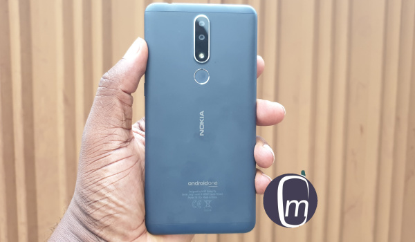
I have owned Nokia phones, from the 3310 through the Symbian S80 Communicators through the Symbian S60 age, through the alliance with Microsoft that produced Windows-powered Lumia phones, all the way to the present generation of Android powered phones. You would be right to consider me something of an expert on Nokia phones. Since the brand’s return to smartphones after the failed experiment with Microsoft, I have observed something that I couldn’t quite nail until now – this current crop of Nokia smartphones are built with a philosophy in mind: that of ergonomic phone design.
Either that or the HMD Global team are just getting it right by mistake. But I doubt that such a mistake can be repeated again and again for as long as it has gone on. So maybe the Nokia design team does not call it ergonomic phone design. Perhaps they use a more fancier phrase or tag. It doesn’t matter. What matters is that when ai take a Nokia phone in my hands, it does not matter how many more features other phones available to me have, I am always pulled back to pick up the Nokia. It feels very natural in the hand. Which is why I refer to the concept as ergonomic phone design. What does that mean?
What is ergonomic phone design?
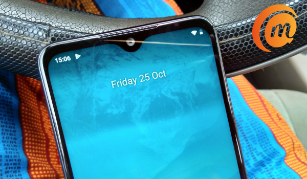
Ergonomics is defined as relating to or designed for efficiency and comfort in use. E.g. ergonomic keyboard design” refers to the design of a keyboard in such a way that it is optimised for human use and comfort in the most natural way possible. Ergonomics (from the Greek word ergon meaning work, and nomoi meaning natural laws), is the science of refining the design of products to optimize them for human use. … Computers and related products, such as computer desks and chairs, are frequently the focus of ergonomic design. The result of ergonomic phone design is a device that feels very natural in the hand, and is pleasant to hold and use. And that was exactly how I felt about the Nokia 3.1 Plus when it came in for a review last year. And that is how I feel about the Nokia 6.2 right now.
I have handled a few smartphones that are much more powerful and much more expensive smartphone than the Nokia 6.2. Yet despite all of the greater advancements, I keep picking up the Nokia for use. It just feels more natural, more comfortable, more refined in the hand. It isn’t too thick, too heavy, or too anything. There is a balance that it has. Make no mistake about it: these other devices are beautiful and well built too, so I am not talking about the build quality issues. They also have a more powerful processor, more RAM, more storage, bigger battery and/or better cameras. So, you must understand that it has to take something serious to have a better featured phone in hand, yet keep dropping it to use a less featured smartphone. It speaks volumes of Nokia’s design language. It tells of the attention and effort that the design team puts into making the phone a joy to hold and to use. That is a testament to Nokia’s efforts at designing smartphones that are ergonomic. Rather than throw everything at the phone and tweak the form to fit them all, the features are measured to fit into a form that has been designed to produce the most natural, most comfortable comfort for the hands. It is difficult to fully describe. It is more of something you need to experience. So, you don’t get a phone with a massive battery and that ends up feeling a little uncomfortable in the hand. You get one that feels absolutely welcoming in the hand and with a battery that gets the job done. Check out my detailed Nokia 6.2 review for a full picture. Like I said earlier, I do not know whether this is a deliberate design culture at HMD Global, but I am inclined to think so. I don’t think that they started out that way with their Android smartphones. I remember the Nokia 8 didn’t feel this way. A few others I handled years ago too. But the more recent Nokia smartphones clearly spring from a place of thoughtful thinking and are stellar examples of ergonomic phone design. That principle is the same that runs in the software: keep things clean and lean. Remove all unnecessary and leave only that which is essential. It is the kind of refined minimalism that exudes elegance and attracts people with fine taste. Follow MobilityArena on social media! We love to connect with you. Do not forget to follow us on Instagram, Facebook, and Twitter.

